Novuz Retail
Where Brutalist Precision Meets Retail Swagger.
Unapologetic. Structured. Striking. NOVUZ isn't just a name — it's a language. A visual system rooted in abstraction, linearity, and the confident brutality of modern retail ambition.

Even the smallest elements are statements of identity. Their envelope, dressed in a deep electric blue with a burnt orange interior flap, feels more like a premium invitation than business stationery — bold, architectural, and impossible to ignore. It doesn’t just carry documents; it sets the tone before the first page is read.

Business cards take a daring leap — a soft, blurred backdrop that feels almost atmospheric, contrasted by the sharp elegance of the Novuz logotype. It’s a tactile experience of clarity and contrast, finished with a whisper of fashion-forward cool.


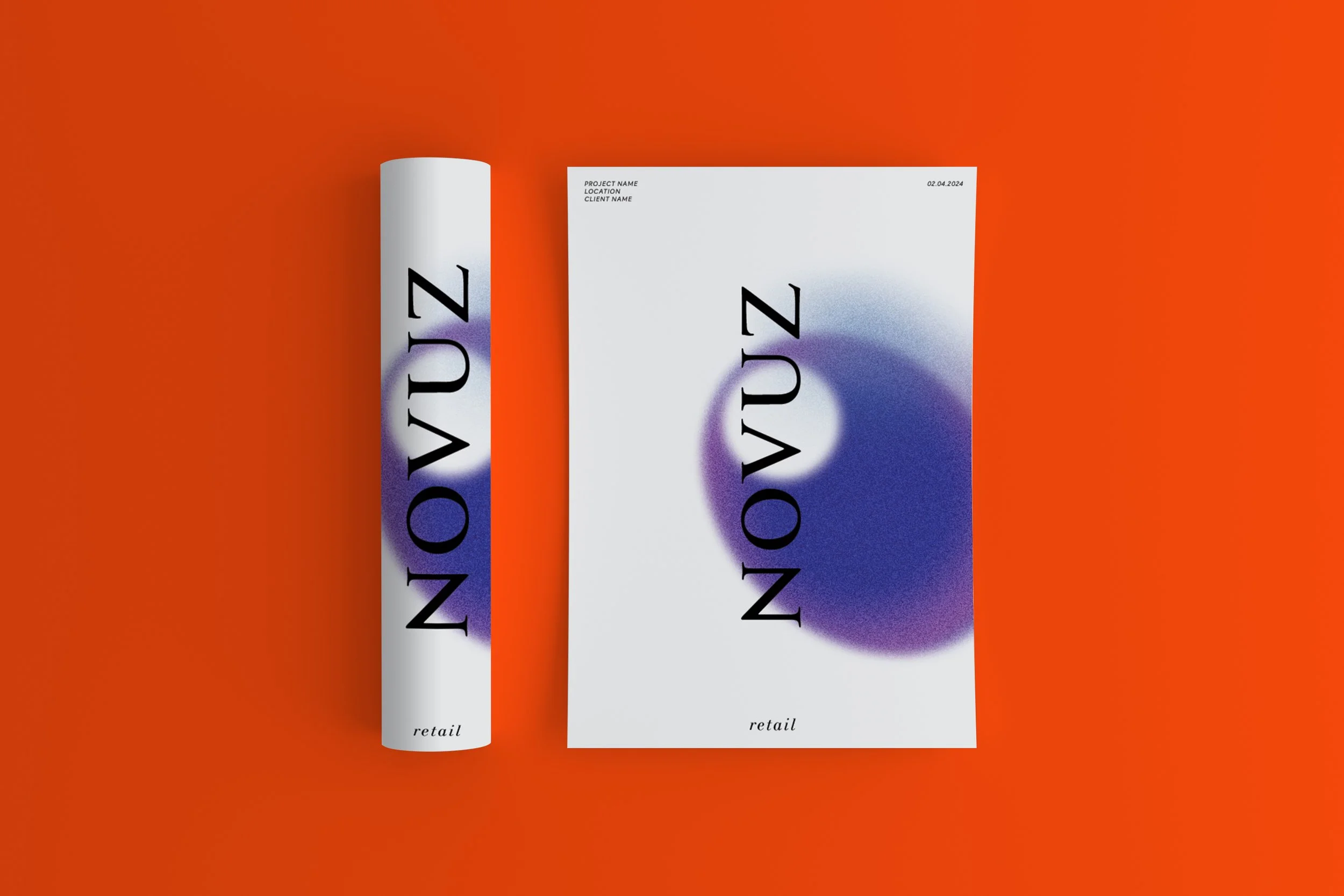
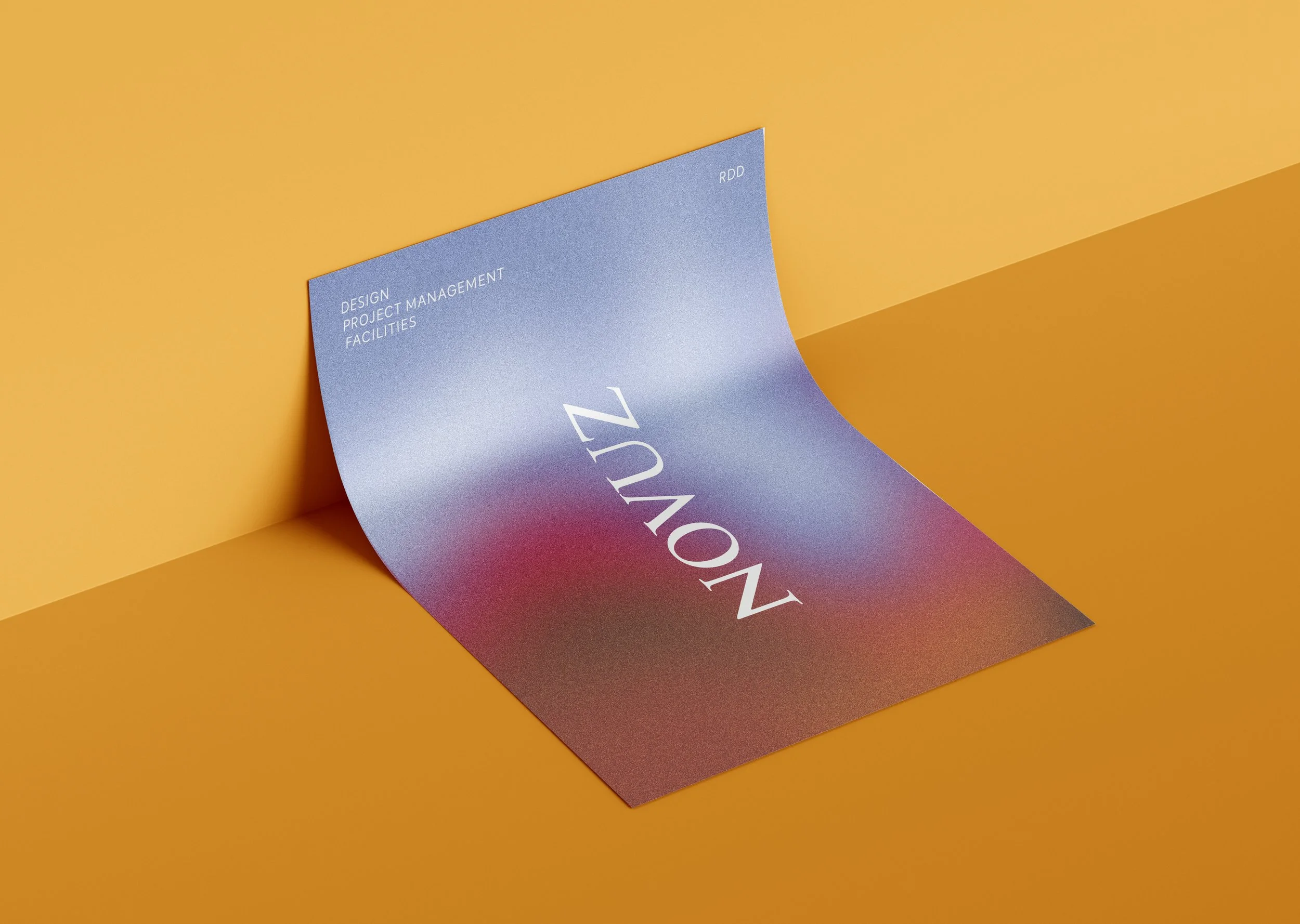
For Novuz, documentation isn't just paperwork — it's the backbone of their business. With extensive technical proposals and large-scale reports forming a daily rhythm, the visual clarity and impact of these documents matter. We developed a series of striking cover pages tailored to their key divisions — retail design, project management, and facilities — ensuring every document opens with intention and identity.


Technical Proposal Back Cover

Technical Proposal Front Cover

Retail Proposal Cover

Design Proposal Cover

Retail Proposal Cover 2

PMC Proposal Cover
Branding that Builds Legacies.
At Novuz, identity isn't applied; it's engineered. Our branding practice crafts visual systems for retail and PMC firms that resonate with audacity. We design presence — bold, architectural, unmissable.
PMC = Project Management Consultants
-
We draw from structure, fashion, and unapologetic visual drama. Think guilty retro, think abstraction, think color without restraint.
-
Custom typographies. Contrasts that spark memory. Consistency across every touchpoint.
-
Letterheads, envelopes, email signatures, technical proposals, and more. Crafted with precision, unified by vision.


At Novuz, documents aren’t just internal tools — they’re instruments of influence. From project proposals to strategic decks, every file that leaves their desk needs to hold weight. We approached their document covers like fashion designers crafting a seasonal collection: bold silhouettes, controlled drama, and unmistakable identity.
Each segment — Retail Design, Project Management, and Facilities — received its own cover language. A strict vertical grid and unapologetic type placement bring structure, while gradients and abstract forms deliver emotion. The result? A library of covers that command attention in boardrooms and beyond.
We pushed boundaries with color, allowing gradients to span the full spectrum — blue, amber, violet, lime — making each document distinct yet unmistakably Novuz. The blur effect wasn’t just an aesthetic flourish; it was a visual metaphor for energy in motion — ideas taking shape, spaces coming alive.
These weren’t templates. They were brand assets. Designed to be reused, remixed, and instantly recognized. When your business runs on documentation, you don’t just send PDFs. You deliver visual authority.
Bold typography, deep blue confidence — Novuz shows up before you even step in.
Project Highlight
/ A bold, late-night fashion after-party mood. Letterforms rooted in structure. Colors that break the rules. We gave Novuz Retail a wardrobe worthy of its architectural attitude.
Fonts used
/ BabelSans
/ Goudy Trajan
/ LTGianotten
/ Duru Sans
Tone
/ Premium, poised, and sharp-edged.
What We Delivered
/ Complete visual identity system
/ Technical and pitch deck templates
/ Digital stationery (email, docs, signatures)
/ Business card and corporate collateral
Let’s Build Your Brand With Backbone
Design Nomad now brings its award-winning design ethos to the world of branding. Whether you're a startup or a scale-up in retail, F&B, or design consultancy, we create brands that don’t whisper. They declare.